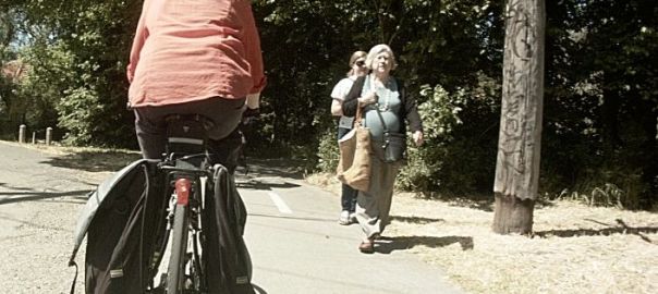
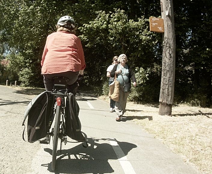
Which way to go? The signage of Melbourne’s bicycle paths is famously poor and these examples from the Merri Creek Trail are some of the recent additions putting “design” ahead of function.
Ignoring the graffiti on the lower warning signs (including an array of 12 pictorial warnings/prohibitions) what is supposed to guide the user is the brown sign atop the post. Showing several locations the largest font is similar in size to a newspaper headline, except placed out of normal sight lines and trying to be read from a passing vehicle. Following some slower riders through a narrow section they repeatedly complained they had no idea where they were on the route despite having passed directly under the signs.
They were not even sure if they were still headed in the correct direction, or had departed from the main route. Given the complexity of the path network it is not unusual to diverge from the intended route and the backtrack some distance after discovering the path terminate into a road. An illustrative example from the Merri Creek Trail is the section around Rushall Railway Station:

Travelling north-south the designed route actually diverts to the right side of the map linking through backstreets (not continued through for clarity) but a similar length detour down the left side keeps to the paths. The signage when approaching this maze of paths:

Here the sign blends in so well with the surrounding parkland that a red circle has been added to highlight it. Unfortunately standards documents are distributed by a (privatised) commercial body in Australia at extortionate prices so the excitingly named relevant standards AS 1742.1:2014 and AS 1742.9:2000 are unavailable for reference (priced at $1933.29 for a personal use only PDF file), preventing the public from auditing these expenditures of government money.

1 thought on “Merri Wayfinding”